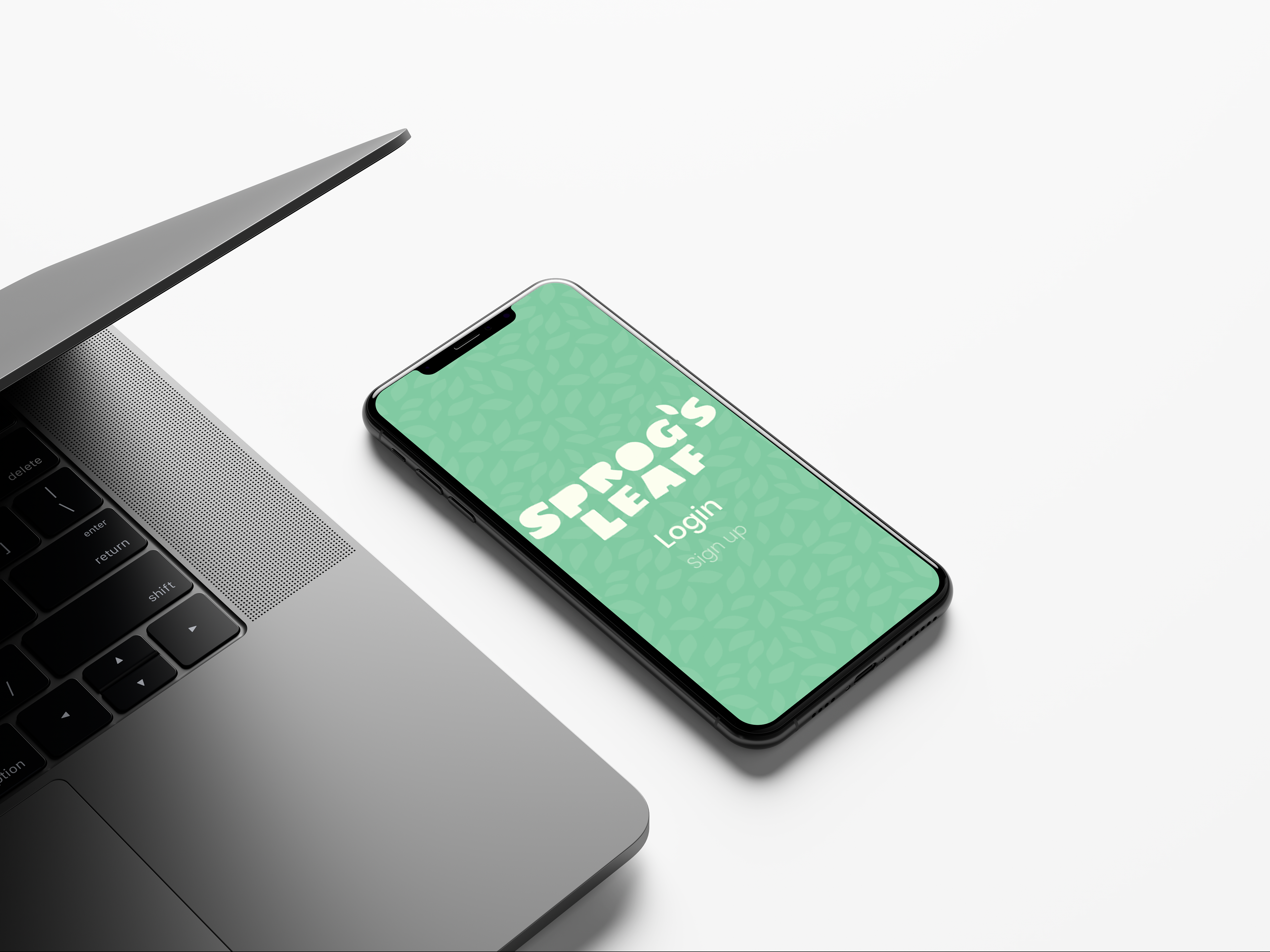
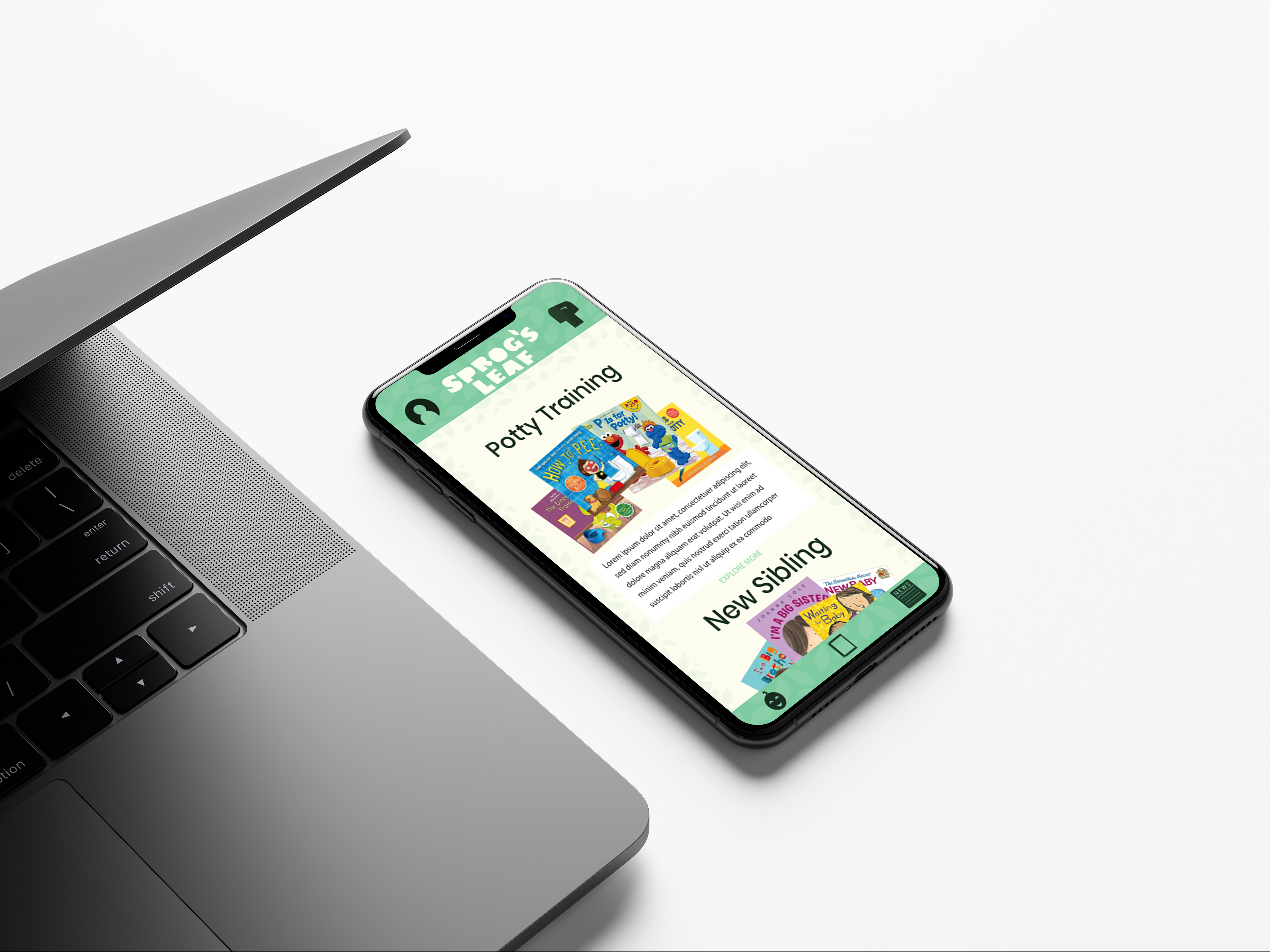
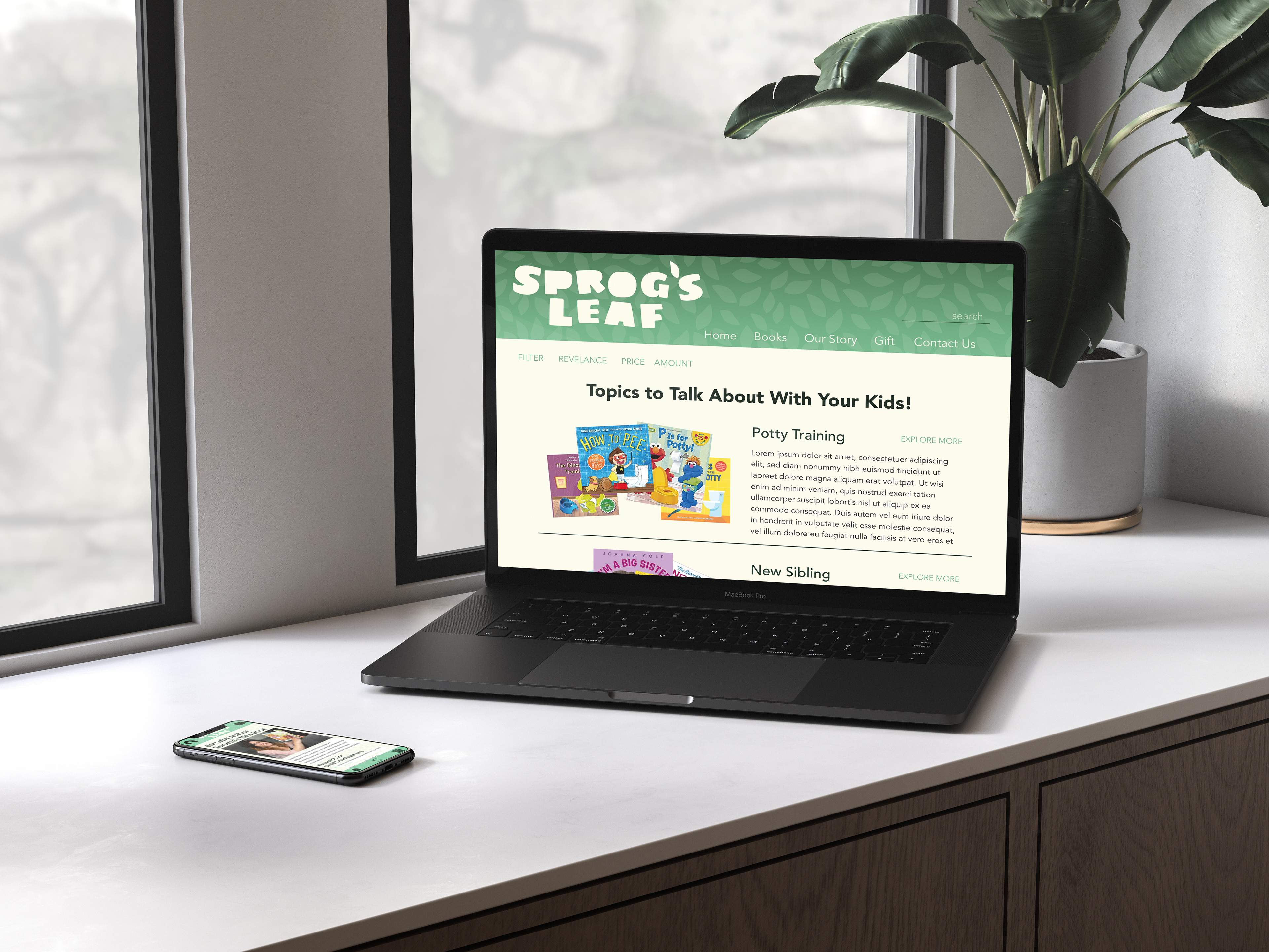
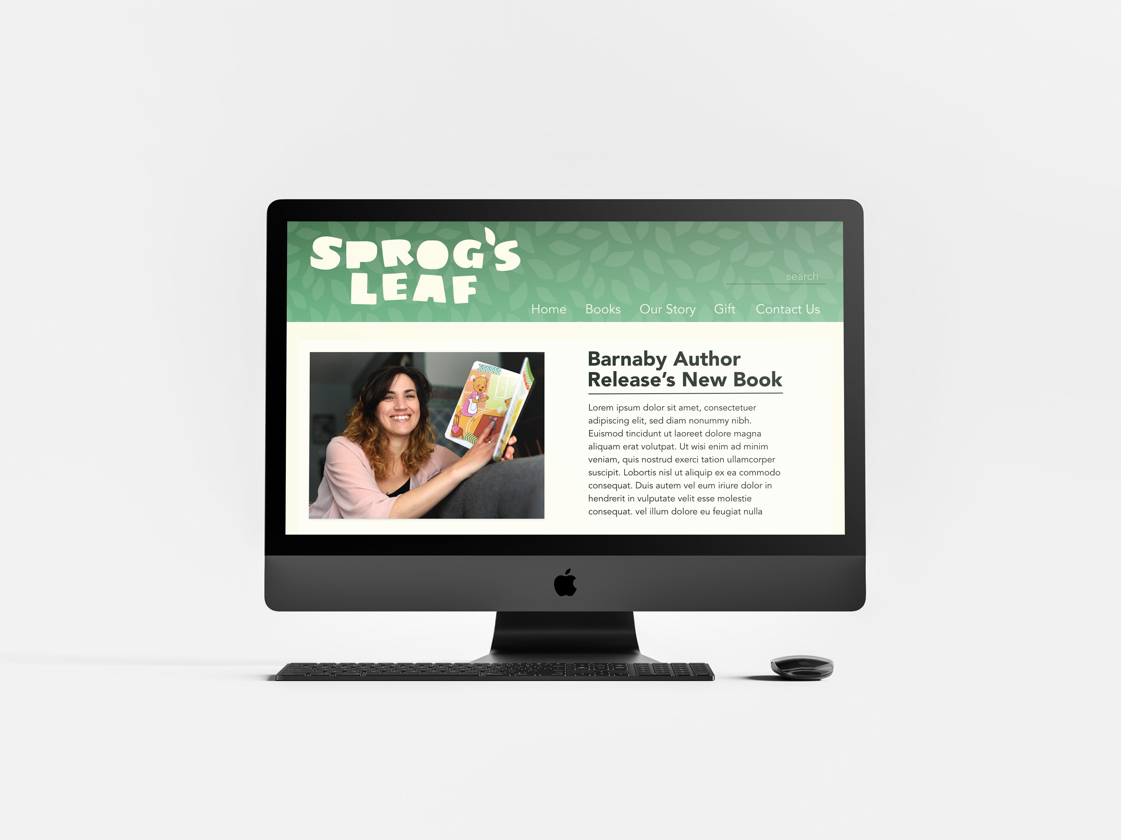
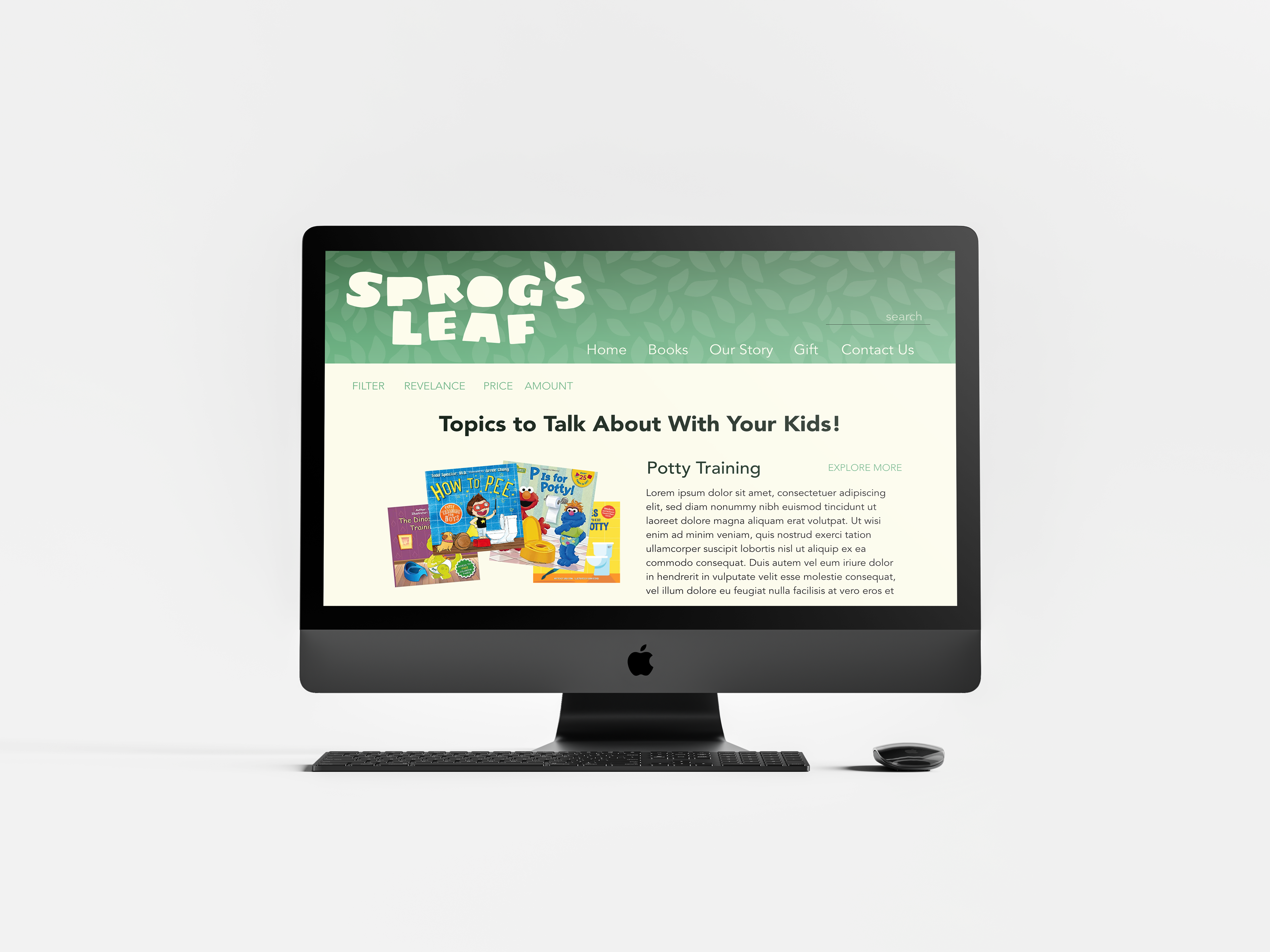
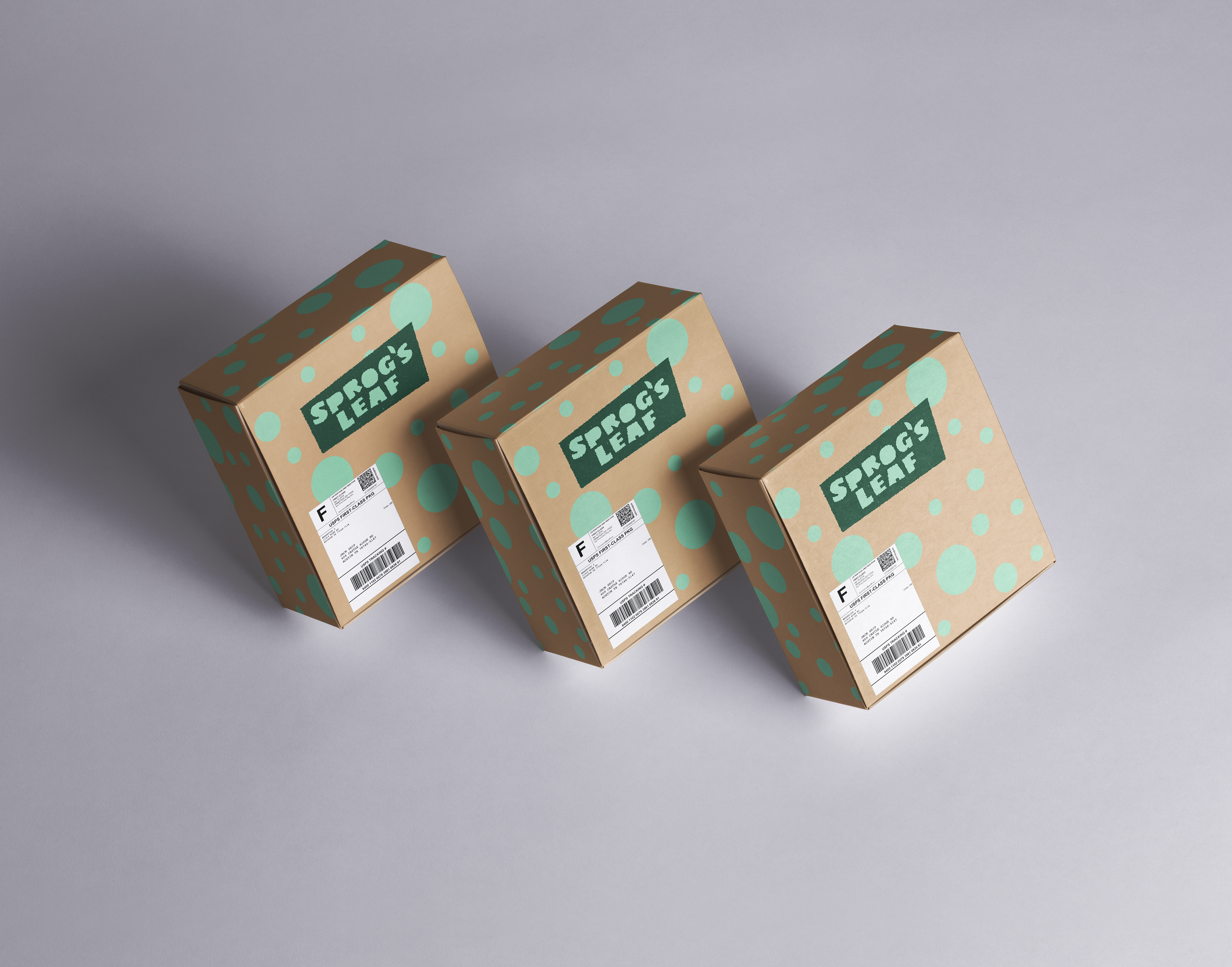
A branding project that was made from the ground up. I created an app, website, and packaging for book subscription services that is geared toward kids. It is marketed to parents with kids who are wanting their children to be more literate and prepared for the world.
The name "Sprogs's Leaf" comes from the an informal version of child deriving from British vernacular. I choose leaf for leafing through a book.
The colors I choose were gender neutral, inviting, and fun for all ages.
The title type I wanted to make it kid like and fun. I choose chunky type and modify to be more sleek than its original type was and deleted the counters from it.